KUDA / EOTY REPORT
Showing customers how they spent their money to help them better understand their relationship with money and make more informed financial decisions.
Product Design
UX Research
Illustration
Data Visualization
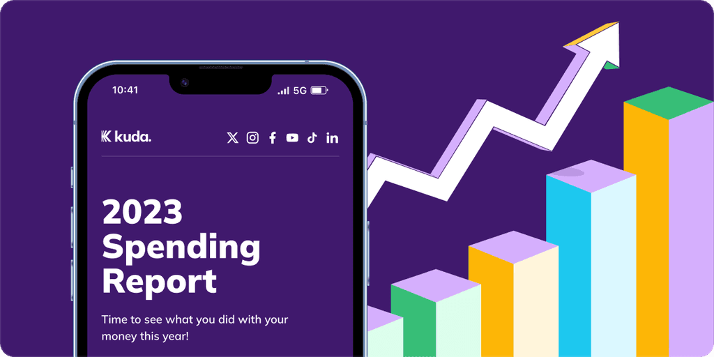
At the end of the year, people tend to do a review of how their year went. Kuda customers are no exceptions. The end of the year spending report or #KudaWrapped was introduced in 2019 but hadn’t been consistent.
Last year (2023), we decided to bring it back but we had a short timeline to implement because we couldn’t get all the data early enough. We had a week timeline for design and the remaining 3 weeks for building.
We had the following data points to work with:
Account Balance
Deposits and transfers
Card transactions
Cardless transactions
Airtime & bill payments
Savings
Overdraft
Investment
Goals
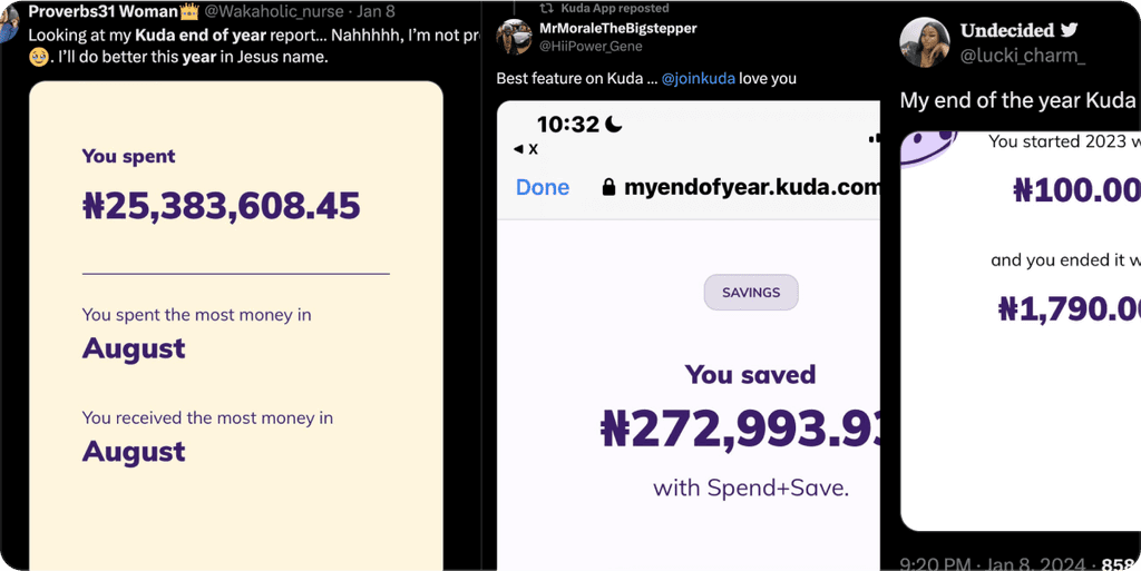
Show customers how they spent their money on Kuda
Increase brand awareness
Onboard new customers and reactive old customers
Problem
We had a tight timeline to deliver quickly and efficiently.
We all volunteered to work on this project so we juggled this with other assignments.
We had a lot more data points this year because we had more features on Kuda and we were also able to now track more data compared to previous years.
Solution
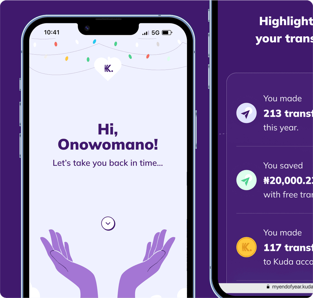
Since it was a dynamic website, we first off agreed on a theme for the website, we chose to retain a very similar style to the previous years but different layouts for the different sections. We split each section into categories and we assigned multiple categories to people.
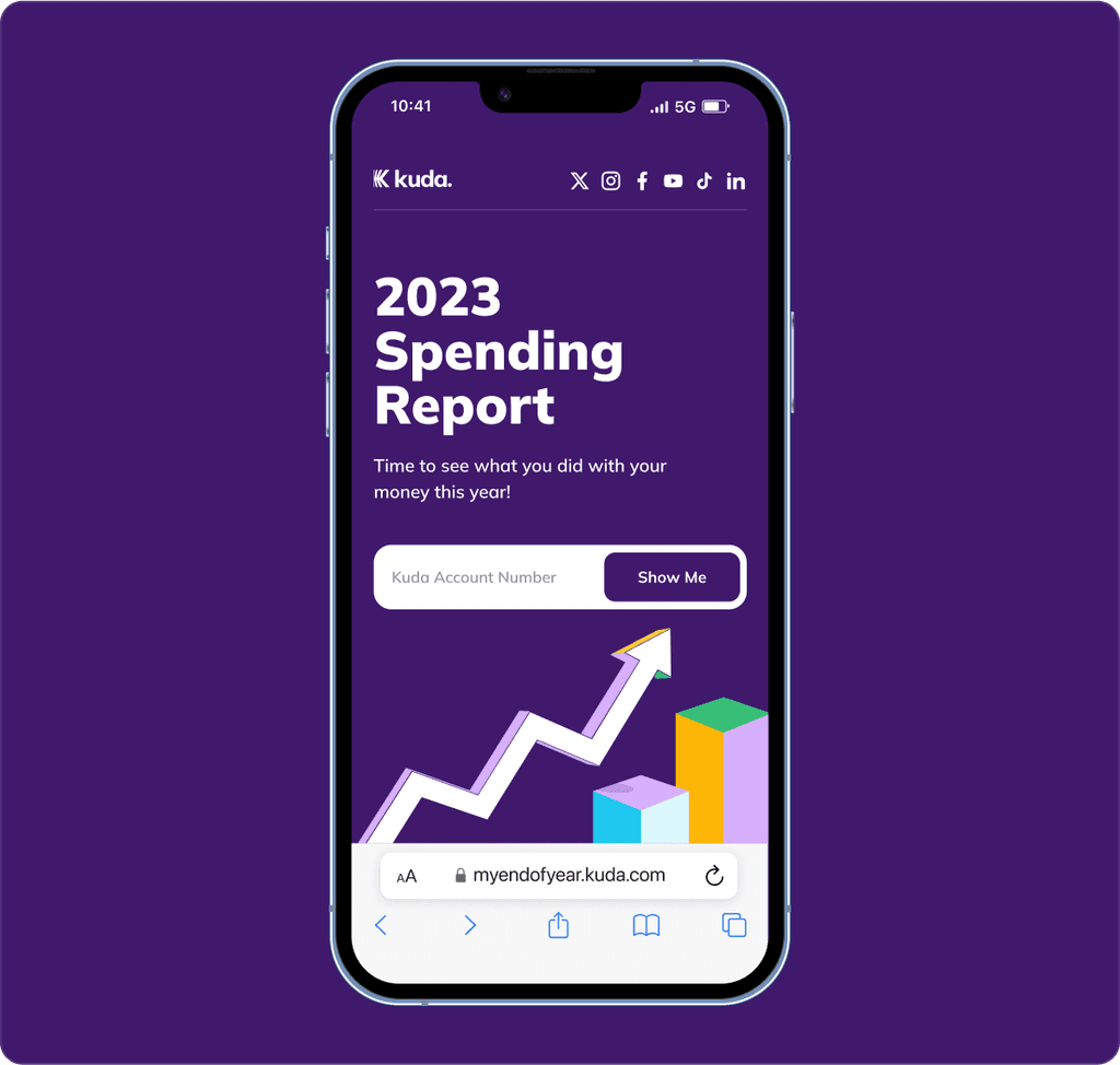
We used the existing flow, which was to ask the customers for their account numbers so we could send a link to their reports via the email they signed up to their Kuda accounts with, to make sure no one else got access to their financial information.
After creating a wireframe with the data we had, each of us went ahead to create iterations for each section we assigned to ourselves, while we did this we worked directly with the UX writer to clarify how we communicated to the customers.
We set up review calls twice that week, and we were very particular about testing each section as a whole to see how each section transitions into each other.
I was sure to create an empty state for features the customers didn’t use or to completely hide the section for sub-features.
Before we launched to the public, we were able to test in-house to make sure that the data returned was correct and not corrupted, and after a week of testing, we went live early in January 2024.
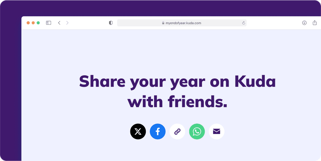
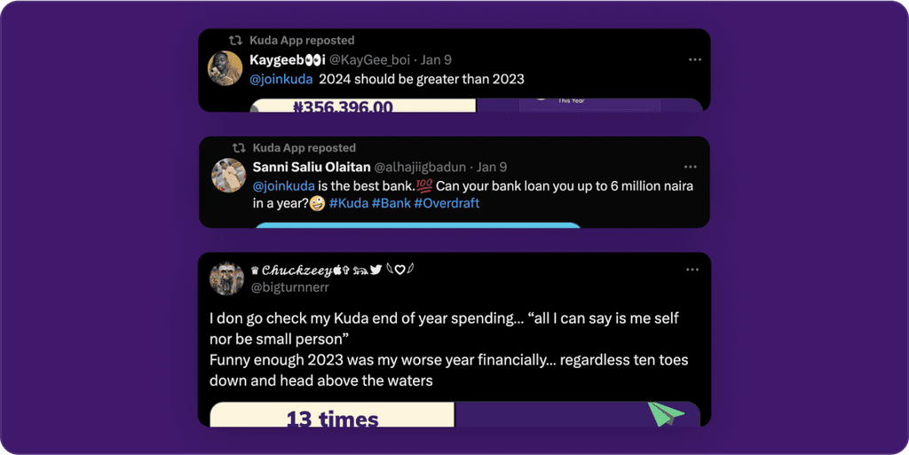
We got people talking on Twitter (X). A lot of positive feedback and engagement from the community after going live.
Takeaway
Data and insights are very helpful to everyone. We are exploring extending this into mini-monthly reports so that customers can already tell how they are doing financially before the year runs out.
Plan for the end-of-year report with the previous year’s data, so we don’t have to work with a short timeline
Think of the holistic view: we created different sections independently but in the end, we had to bring them all together to be sure they worked well.
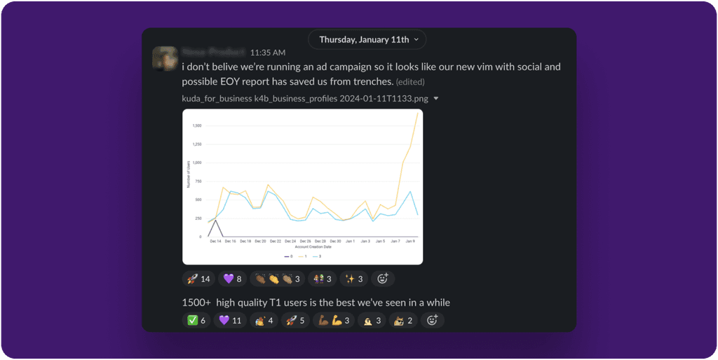
We got over 1,500 new customers in the week of go-live, which was the highest we had gotten (in a week) in a while.
